Risk Profile Charts
In order to learn about options with maximum speed it's best to transform words and concepts into pictures.
Do you know what buying an asset like a stock or a future looks like? In order to find out, we need
to learn how to draw a risk profile chart. This is the cornerstone on which we build far more complex
strategies, so it's important to understand this.
Unlike a standard price chart were the x axis represents time and the y axis represents price, a risk profile
chart is structured as follows:
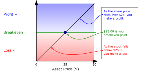
Example - Consider buying a stock for $25.00:
- The X-axis represents the stock price, with the price rising as the line moves right.
- The Y-axis represents your profit/loss for the trade.
- The 45° diagonal line is your risk profile for the trade. As the price of the stock rises, so does your profit. So when the asset price rises to $50.00, you make $25.00 profit.
| Current Price |
- |
Buy Price |
= |
Profit (loss) |
| 50.00 |
- |
25.00 |
= |
+25.00 |
| 10.00 |
- |
25.00 |
= |
(15.00) |
Long Stock Risk Profile Chart